
SeeCurrents is a desktop travel blog that focuses on exploring local island culture.

SeeCurrents users are not just people actively looking to travel, but are looking to go beyond the beach and explore the local culture. This project started when we were approached by the founder and sole stakeholder of SeeCurrents. While she had success in getting businesses to use her website, she had difficulty keeping the average user on the site.
According to Google Analytics, users are not returning to the site after reaching one of the many exit points. How can we increase SeeCurrents' overall retention rate?


Brand matrix | Screener survey | User interviews | Contextual inquiry | Affinity mapping | User persona | Journey mapping | Feature analysis | Feature prioritization | Site mapping | Design studio | Rapid prototyping | Wireframing | Usability testing
SeeCurrents fills a niche in the travel website market. Most of the extremely popular travel websites are popular as platforms to make reservations and book flights. Sites like Culture Trip and Lonely Planet exist as “pseudo-blogs” that contain articles written by users and journalists with internal links for making reservations and buying tickets.
SeeCurrents occupies the same space as these other popular pseudo-blogs but in an attempt to be such a well-rounded site, the app ends up suffering from an identity crisis by not exceeding in any particular area.

3.75/5
Navigation
3.1/5
Satisfaction

The biggest problem discovered through usability testing the existing site was the repeated use of stock images for the list of activities. This made people not only distrust the site but also distrust the legitimacy of the hotels and tours that were posted. People were unsure of the purpose of the site as well.
Options for hotel and flight booking were rudimentary or nonexistent. Both would take you to an external booking site that discouraged users from returning. Users were confused. Was it a travel logistics app like Travelocity or was it a blog?


When doing research, users tend to get easily lost by the number of tabs and windows they have to keep open.

People are just as inclined to travel somewhere based on liking the country as they are based on the activities they can do there.

Users expressed interest in grouping their activities to an easily travelable area.
We affinity mapped the results of those interviews and created our persona, Ellie.
Ellie naturally Googles what location she’s interested in and activities to do. This results in her having many tabs of different websites open simultaneously and it becomes difficult to make an itinerary as a result. She wants all the relevant information to be in one spot, with plenty of pictures and users giving their recommendations to verify its legitimacy.

Ellie starts the journey map being recommended SeeCurrents by a friend. Ellie's journey takes information from both user interviews and usability testing results. Ellie is confused about what the purpose of the site is. The many exit points do not encourage her to return back to SeeCurrents. The lack of any legitimate visuals makes her question the legitimacy of businesses being hosted on the site. She might as well go back to using Google and find her information there.

Users had issues regarding organization and planning an itinerary. In our journey map, Ellie had zero desire to return to SeeCurrents after being transferred to a third-party flight/hotel booking app. If RSVPing cannot be done internally, the site needs to change direction and focus and nix the ability to do so altogether.
Now, without the exit points cluttering the site, SeeCurrents becomes much less of a reservation and ticket-buying site and much more of an informational one. To figure out what direction to take our site, we did a competitive and comparative analysis with other travel blogs. We also looked at comparators like food blogs for inspiration as well.
Highlighted below are the two categories where we found quick and easy-to-develop opportunities that would make SeeCurrents unique.


We usability tested a mid-fi prototype with 8 different users and received some important feedback.
1. Users became far too reliant on using the Search bar to navigate the site.
2. Our method of organizing activities into an “Explore” section and articles into an “Experience” section did not work. Users had no idea what those words entailed when it came to navigating the site so they simply ignored it.
3. Users were unaware they could scroll down on the home page to view articles. They also did not expect to find articles to read in the "Experience" section. We needed to further increase the prominence of articles on SeeCurrents.

The existing website had a huge problem regarding exits. Too many destinations on the site would take users off SeeCurrents and onto sister sites. This cuts into our stakeholder's ad revenue and exacerbates the problem our persona, Ellie, is facing by having too many tabs open. Creating a user flow made it clear that the best way to keep users engaged with the site would be to increase the prominence of articles, since reading those does not end with their potential exit from SeeCurrents. The user flow also highlighted the need for two equally-weighted methods in which a user can find something to do:


PAIN POINT: Users couldn’t figure out the difference between the options in the primary navigation. Users ended up just using the search bar.
SOLUTION: Changed the primary navigation so that users can directly search by activity type. We also increased the size of the visuals to give more prominence and legitimacy to the locations and activities they talk about. The page is now set up to show users there is more content on the page if they scroll down.
%201.png)
PAIN POINT: The stock photos made the locations feel fake and the events like a scam.
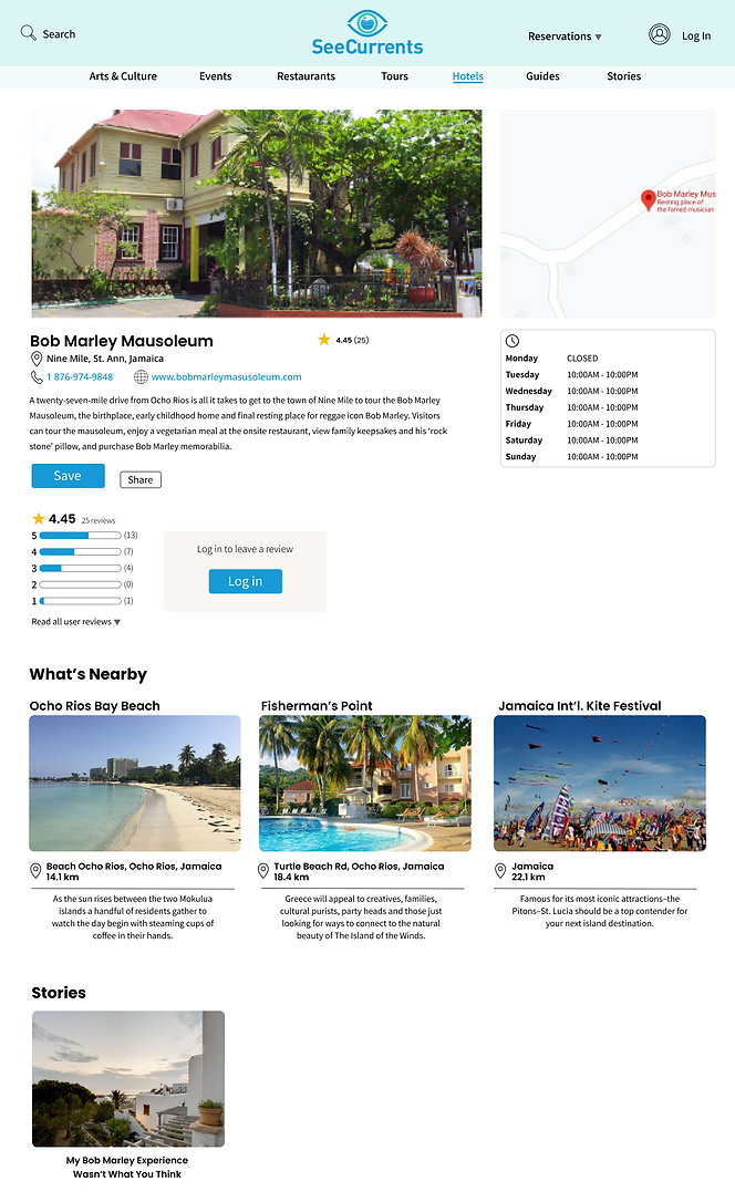
SOLUTION: Pictures now represent the actual location they belong in. A money filter was added so users can hide activities that are beyond their spending range. An “open now” filter was added for users currently using SeeCurrents while traveling and looking for sudden places to visit.
%203%202.png)
Changes: Added a “What’s Nearby” section and increased its prominence from the mid-fi. The section shows locations and events happening within a 30km radius.

Added: The Stories Page is new and entirely community-based so that users can read experiences from site contributors. This will further increase the trustworthiness of the activities and locations featured on SeeCurrents.
4.3/5
Navigation
4.4/5
Satisfaction
Users skewed heavily towards searching by activity first in the primary navigation. This is a problem since we had a sizable amount of interviewees also wanting to search by location first.
The Search bar was largely ignored. Multiple users stated they viewed it more as a backup instead of as a method to look up a destination.
Based on this observation, we changed the text in the search bar to read “Enter Destination” instead.

Since this was simply the minimum viable product, there are a few changes I would make for the next iterative cycle:
• Add “Destinations" to the primary navigation so that users have the true choice of searching by location first or by activity first.
• The ability to make an itinerary should be added to a user’s account so that they can easily manage when and what time they are visiting an area, checking in to a hotel, or attending an event. This would help to fix the problem of users having too many browser windows open. This would also keep users on the site longer to form their itinerary.
Below are some updated designs I made and shared with the stakeholder after going over my research a few months later.
%20NEW%20New.webp)
SeeCurrents was a site with an identity problem. Users saw that SeeCurrents had the option of booking flights and hotels, but the site itself wasn't capable of doing so internally. It left users wondering why they would use SeeCurrents at all if it just takes them to external sites. Changing the original design to look more like a travel blog meant re-designing the navigation and giving the site an entirely new focus.
Sometimes a website can’t be everything. SeeCurrents was a lesson in subtractive design in order to emphasize what really makes the site unique.
Our client was very satisfied with our final designs and found the insights that the team and I discovered about why users were not staying on the website valuable. I hope to work with such a kind and collaborative stakeholder again in the future.


